|
| ||
| The Ovation Fan Club | ||
| ||
| Random quote: "Believe me when I say that some of the most amazing music in history was made on equipment that's not as good as what you own right now." - Jol Dantzig |
 OT - Graphics help required OT - Graphics help required
| View previous thread :: View next thread | |
| Members Forums -> General Posting | Message format | |
| muzza |
| ||
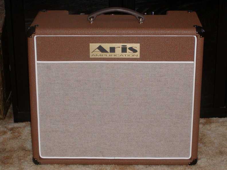
 Joined: August 2005 Posts: 3736 Location: Sunshine State, Australia | Some of you may have been following my amp build on Facebook and in the Downundererers forum. I've been getting a LOT of comments along the lines of "It needs a 'Muzza' label on the front." That's where you lot come in... Design a logo/label that say's 'Muzza'. Either capital 'M' or lower case, and two zee's. I was visualising a script type font, SIMILAR to Marshall, but I don't want it to look like a straight copy. Also, not sure if I should put it along the top, a la Blues Junior, or on the grille cloth. Gimme some options. A pack of Tim Tams for the winner, and a blue and white OFC guitar pick if you haven't got one yet. Let the creative juices flow...
| ||
| |||
| FlySig |
| ||
Joined: October 2005 Posts: 4081 Location: Utah | Place it upside down along the bottom edge.... | ||
| |||
| BanjoJ |
| ||
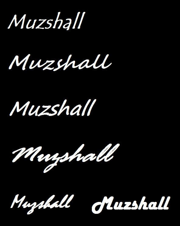
Joined: September 2012 Posts: 815 Location: Thredbo, NSW, Australia | I replied in the wrong thread. Try again. (Amp Labels-2.jpg) Attachments ----------------  Amp Labels-2.jpg (71KB - 0 downloads) Amp Labels-2.jpg (71KB - 0 downloads) | ||
| |||
| DaveKell |
| ||
Joined: November 2011 Posts: 741 Location: Fort Worth, TX | If you don't have one yet, awhile back I posted a thread offering to design band logos for free. It was my job in my career for over 40 years. let me know if you still need it and I'll get right on it. Had an idea as soon as I read this post... and for G o d ' s sake, forget about brush script! It's as overused as helvetica. I can send ya a file you can take to any local sign shop to have a vinyl decal cut from. If fillhixx sees this maybe he will post the logo I did for his band. I don't have it on this computer. I will need a measurement of the total area the logo will fill. Edited by DaveKell 2013-06-18 6:24 AM | ||
| |||
| muzza |
| ||
 Joined: August 2005 Posts: 3736 Location: Sunshine State, Australia | No Dave, I don't have one yet. I only posted this today. Funny what you said about Brush Script. It was my pick of the ones Banjo offered. The others looked like they said 'Muxxa'. But anyway, I'm after something more original. I could've gone through all the fonts myself if that's all I needed. An existing font doesn't qualify as 'creative juices'. I don't know where is the best place to put the logo yet. That's why I've asked for help from you creative types... The front of the amp is (close enough to) 18" wide x 16" high. The 'fascias' above and below the grille cloth are 2" wide. Fascia screws securing the baffle board are 12" center to center. Area of the grille cloth is 16.5" wide x 12" high. Sounds like you might be getting the Tim Tams... | ||
| |||
| MWoody |
| ||
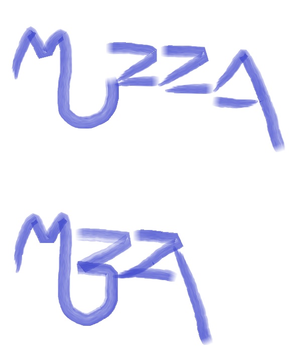
Joined: December 2003 Posts: 13997 Location: Upper Left USA | You need to go with your best market stealing graphic that plagarism can buy!
Edited by MWoody 2013-06-18 9:28 AM | ||
| |||
| cliff |
| ||
Joined: March 2002 Posts: 14842 Location: NJ | Muzz; Send me yer e-MailAddy . . . | ||
| |||
| MWoody |
| ||
Joined: December 2003 Posts: 13997 Location: Upper Left USA | Did you say Juicy! Edited by MWoody 2013-06-18 9:37 AM | ||
| |||
| DaveKell |
| ||
Joined: November 2011 Posts: 741 Location: Fort Worth, TX | muzza - 2013-06-18 8:09 AM No Dave, I don't have one yet. I only posted this today> I'll get on it and have ya something by the end of this week. The file I send can also be used at a signshop with a computerized router so you can have a dimensional piece to attach to the grille cloth with double stick tape. That would be more authentic than vinyl letters in the small area at the top. On to the fun.... | ||
| |||
| stonebobbo |
| ||
Joined: August 2002 Posts: 8307 Location: Tennessee | My brother in law builds boutique amps. He has his logo printed on a metal plate and then attaches it to the cabinet.
| ||
| |||
| muzza |
| ||
 Joined: August 2005 Posts: 3736 Location: Sunshine State, Australia | Woody, you're on fire. What app did you use for the second example? | ||
| |||
| MWoody |
| ||
Joined: December 2003 Posts: 13997 Location: Upper Left USA | Paintbrush... Windows 7, Office 2010... the big squeeky marker.. totally old school. | ||
| |||
| muzza |
| ||
 Joined: August 2005 Posts: 3736 Location: Sunshine State, Australia | Woody, I was only joking about using an app. I thought you'd used an old white board marker and scanned it. | ||
| |||
| cb13 |
| ||
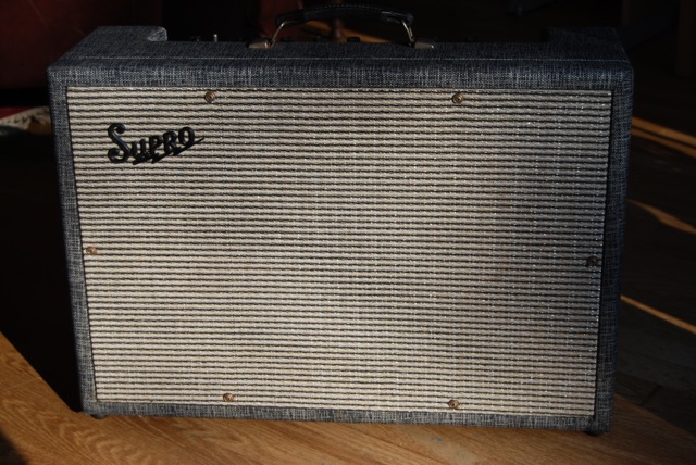
Joined: May 2013 Posts: 8 | Cool amp. Definitely on the grill ala this Supro. I'm not an artist but I see the two Z's in 'Muzza' being linked (kind of like ZZ top) and lightning bolt-like. Are you going to put some labels by the controls? A logo could go there also.
| ||
| |||
| muzza |
| ||
 Joined: August 2005 Posts: 3736 Location: Sunshine State, Australia | I've even got my own creative juices flowing now... (Yeah, I know... they're nothing like what I asked for...)
| ||
| |||
| Gemm |
| ||
Joined: February 2010 Posts: 72 Location: UK | Can I join too???  | ||
| |||
| Darkbar |
| ||
Joined: January 2009 Posts: 4536 Location: Flahdaw | muzza - 2013-06-19 3:22 AM I've even got my own creative juices flowing now... (Yeah, I know... they're nothing like what I asked for...)
I like the one on the right side. Very cool | ||
| |||
| MWoody |
| ||
Joined: December 2003 Posts: 13997 Location: Upper Left USA | Muzza, I was only joking about using an app as well... You are on to something though. Reminds me of what the "Taggers" have been doing to walls and boxcars. | ||
| |||
| dobro |
| ||
Joined: January 2006 Posts: 2120 Location: Chicago | You, know, MUZA means "Muse" in Russian. The script would have to be MY3A... or maybe MY33A for the European market? Russians understand the "Zed" figure so that Bob G's graphic is perfect | ||
| |||
| muzza |
| ||
 Joined: August 2005 Posts: 3736 Location: Sunshine State, Australia | darkbarguitar - 2013-06-20 1:18 AM I like the one on the right side. Very cool Which one? There are 3 different graphics on the right. The 3 on the left are all different too. Subtle differences, but different. Edited by muzza 2013-06-19 4:51 PM | ||
| |||
| dobro |
| ||
Joined: January 2006 Posts: 2120 Location: Chicago | The one on the bottom right, say. If you add just a shade of a tail to suggest a "Y" you got it. The double Zed looks single enough to really mean "MUSE" in Slavic. Really cool! | ||
| |||
| dobro |
| ||
Joined: January 2006 Posts: 2120 Location: Chicago | Sorry... I'm Dyslexic.. The one on the bottom LEFT | ||
| |||
| DanSavage |
| ||
Joined: June 2012 Posts: 2347 Location: Pueblo West, CO | muzza - 2013-06-19 12:22 AM I've even got my own creative juices flowing now... (Yeah, I know... they're nothing like what I asked for...)
Bottom right. The 'U' on the left logos looks like a 'V'. | ||
| |||
| Guitsome |
| ||
Joined: April 2011 Posts: 121 Location: NH | DanSavage - 2013-06-20 10:33 AM muzza - 2013-06-19 12:22 AM I've even got my own creative juices flowing now... (Yeah, I know... they're nothing like what I asked for...)
Bottom right. The 'U' on the left logos looks like a 'V'. Is this one of those "brain games"? I agree with Dan. But, personally, I like like the logos on the left as they are more decipherable. I would try to make the "U" look more like a "U" though. The Z's on the right seem to get lost to me, but very creative nonetheless. | ||
| |||
| DaveKell |
| ||
Joined: November 2011 Posts: 741 Location: Fort Worth, TX | http://i1154.photobucket.com/albums/p538/davekell1/Muzza_zpsbe9c9da... Based entirely on originally stated specs. | ||
| |||
| Jump to page : 1 2 Now viewing page 1 [25 messages per page] |
| Search this forum Printer friendly version E-mail a link to this thread |
| This message board and website is not sponsored or affiliated with Ovation® Guitars in any way. | |
| (Delete all cookies set by this site) | |


