|
|
Joined:
April 2006
Posts: 972
Location: PDX | Being a new member, and a new Ovation owner, i have made an observation that i would like to have critiqued with your input. My observation, below, leaves me a bit confused.
As i look over the product line of Ovation, it seems the majority of body styles are designed the same. No finger-style OOO, OO, Concert etc shapes or overt Dreadnaught body styles.
Is this just my unfamiliarity with the line, or is it indeed an accurate assessment of the line. Perhaps the Ovation innovation is that their guitars play equally as well for both styles?
Just curious.
_____
gh1 |
|
| |
|
Joined:
February 2002
Posts: 5750
Location: Scotland | Until the '97 collectors parlour size there was a single body outline, though this has been offered in several bowl depths (artist, mid, deep, supershallow, Adamas extra deep and the new contour depth) Each of these imparts it's own tonal flavour to the standard Ovation shape. Then there's the options of neck width, 12 fret/14 fret neck joint, multi-hole/centre hole, wood top/composite top, cutaway/non-cutaway etc etc.
Style is dictated by the player, not the guitar. There are plently of fingerstylists who play dreadnoughts, and lots of strummers who prefer the balanced tone and comfort of smaller bodied guitars. Ovation offer enough variations on the one basic concept to have something for pretty much every style. Except for the wood snobs, obviously |
|
| |
|
Joined:
March 2005
Posts: 12762
Location: Boise, Idaho | With the single hole and multihole and cutaway versions, plus all the differences in bowl depths, I always thought Ovation offered lots of variety. My wife keeps asking how many different models they make. |
|
| |
|
Joined:
May 2003
Posts: 4389
Location: Capital District, NY, USA Minor Outlying Islands | gh1, stop looking and start playing.
Try these:
Adamas CVT
1778 Elite
Ovation Legend
Country Artist --- Nylon and steel string
I'd like to know what you think of them.
You'll see the differences, welcome aboard. |
|
| |
|
Joined:
May 2002
Posts: 651
Location: Australia | Well I've always wondered what the inspiration was for the O shape in the first place.
....maybe Bill could chime in here |
|
| |
|
Joined:
May 2003
Posts: 4389
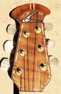
Location: Capital District, NY, USA Minor Outlying Islands | Actually I was curious about the fonts used on the headstocks. If I'm off base please tell me. My favorite is the Ovation Arabian Night's font. It evokes, for me an exotic moorish / spanish flare. I also like the Adamas font based on the Harlow font, interesting mix of 1970 neon script and 1950's streamlined industrial design. I bet there's a story behind all of them. |
|
| |
|
Joined:
July 2003
Posts: 1922
Location: Canton (Detroit), MI | I have grown to think of the different bowl depths as relating to the Martin body sizes. Deep bowl is a dreadnought, mid-bowl is a 000 or OM, super-shallow-bowl is a 00 or an 0. I realize that it is far from a perfect analogy, though.
Roger |
|
| |
|
Joined:
January 2002
Posts: 14127
Location: 6 String Ranch | Fonts??????
Ques-que Font?
The O shape? I don't remember right now, let me think about that some..... There was a D shaped bowl made, Al has one. I think they just wanted it to look different than a M guitar on stage. |
|
| |
|
Joined:
March 2002
Posts: 14842
Location: NJ | Fonts. Type(lettering)style. Used in the logos.
The Arabesque style was real popular with designers/typographers in the mid-60's.
I don't think that Adamas was done in Harlow . . .
Harlow was a bit more ArtDeco-looking.
I could be wrong though (I haven't used it since the early 80's) . . . .
I'd found it odd that they were using the Arabesque on the headstocks (and other stuff) and that "stenciled" derivation of FuturaExtraBlack on the cases (and yet more stuff). Seemed a bit incongruous to me(but whaddu I know?). . .
(Too bad we can't ask Randy Hess) |
|
| |
|
Joined:
May 2005
Posts: 486
Location: North Carolina | Originally posted by richardd:
[QB] Well I've always wondered what the inspiration was for the O shape in the first place.
As a teenager, I was in a music store when the first Ovies were being delivered by the Ovation guy. I had never seen or heard of them, and asked him about the shape. He told me this was the best shape for projecting the sound and this was the constrution of many medieval instruments. But the cost of such construction was prohibitive, so the box design was adopted. Now that the backs could be molded, this design could now be mass produced.
That's what he told me anyway. |
|
| |
|
Joined:
May 2002
Posts: 651
Location: Australia | I don't know if it's totally true but it certainly sounds impressive. |
|
| |
|
Joined:
March 2005
Posts: 12762
Location: Boise, Idaho | I heard it somewhere, too, so it must be true. |
|
| |
|
Joined:
February 2002
Posts: 5750
Location: Scotland | While it's true that some early guitars used lute-type construction for their round backs (kinda like Neapolitan style mandolins) it's interesting that the first Ovation fibreglass body was atually a standard dreadnought size with flat back and sides. But this design proved to be structurally weak and needed bracing just like wood, so they went to the rounded shape which utilises the basic physics of the eggshell principle. Basically a parabola is self-reinforcing. |
|
| |
|
Joined:
January 2002
Posts: 14127
Location: 6 String Ranch | All this was before Randy's time. The original logo was by Chuck McDonough I think. The rest just came and went after that, no real plan to any of it. Chuck also did the original Adamas logo on the 15th fret on the slots. He was an artsie guy. |
|
| |
|
Joined:
May 2003
Posts: 4389
Location: Capital District, NY, USA Minor Outlying Islands | He came up with two great fonts (logos). Would've been interesting to get his thoughts. They are definetly classics that've stood the test of time. Musing on fonts: The Fender font is based on the Brush Script, which was invented in the 1940's, the same time Fender made his guitar. And thanks to Cliff, I've learned that the Arabesque font was popular in the 60's, the same time Ovation was being born; and I read that the Harlow (I really believe it's Harlow) font was invented in the 1970's, the same time the Adamas was aborning.
All of them design classics, rooted in their own eras but evoking other values. I reckon the most distinctive and attractive guitar logo, to me, used today, is the Ovation arabian.
I found that Ovation stencil incongruios too. I think what they were striving for was a kind of "shipping" stencil, like in the army, when you just put a stencil on the outside of the box, and the inside was something totally irrelevant to the stencil. When you look at like that it kinda makes sense. |
|
| |
|
Joined:
July 2004
Posts: 812
Location: Hicksville, NY | I never paid much attention to the shape of the Ovations, until I discovered the OFC. Heck, I never even realized that Ovations made solid-body electric guitars too! The first time I was introduced to Ovations, it was the colorful finishes that grabbed my attention, in addition to its bowl-shape backs. I remembered inquiring about them, and the salesman at that time replied to me, that the round backs were designed for better sound projection. I never knew what he meant back then, but I surely loved the sound of the Ovation when he played it. Of course, it would take me another 10 years, before I end up buying my first, and so far, my only Ovation guitar.
Later on, I would discover that there are many different varieties of Ovation guitars, most particularly the differences in sound and tone from the bowl depths alone. While I like the appearance of Ovations with epaulets and multi-sound holes, I still prefer the one with a single sound hole. |
|
| |
